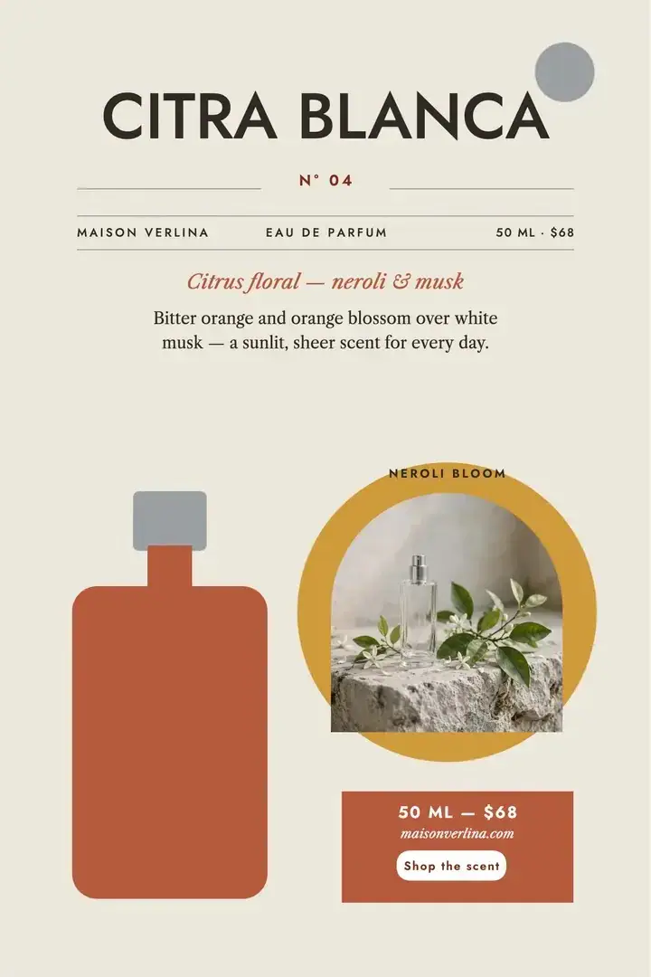
Product launches
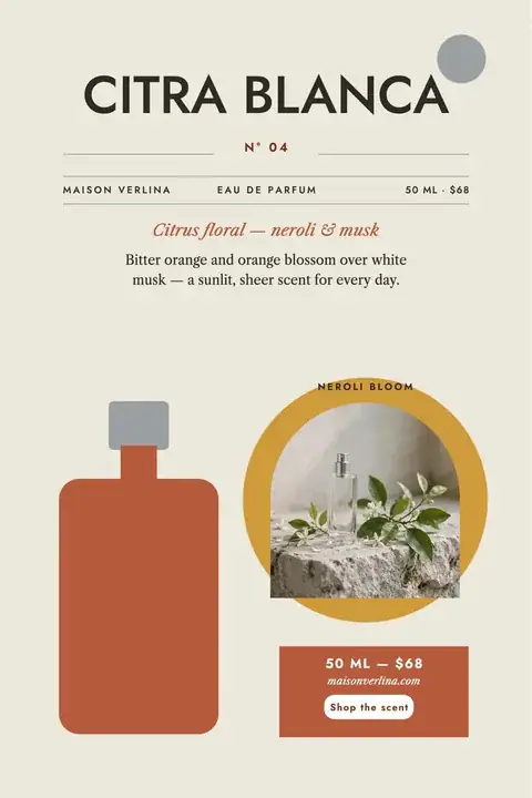
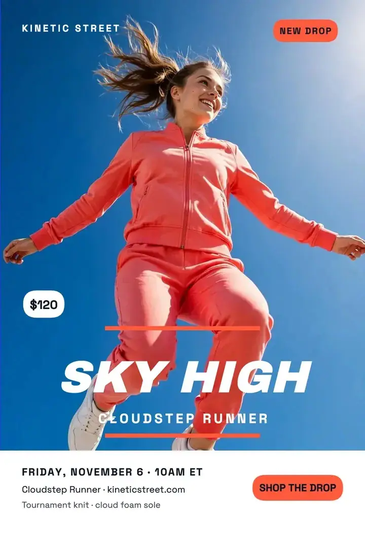
Lead with the product, then give its name and one reason to care. Try restrained colors, a generous product area and a short line that makes the launch feel distinct.
Turn your idea into a poster worth a closer look. Describe the message, add a photo reference if you have one, and create a design for your next launch, event or everyday announcement.
Sample Images
Explore poster design ideas by purpose. Choose a starting brief, replace the sample details with your own, and bring the direction into the generator above.
Lead with the product, then give its name and one reason to care. Try restrained colors, a generous product area and a short line that makes the launch feel distinct.
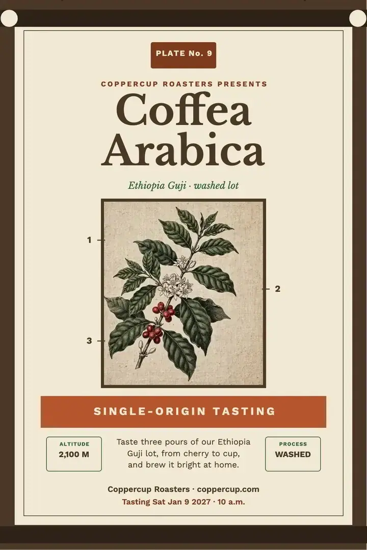
Give a seasonal drink, a new menu or an opening day its own visual identity. A clear item name and one useful detail can communicate more than a crowded list of offers.
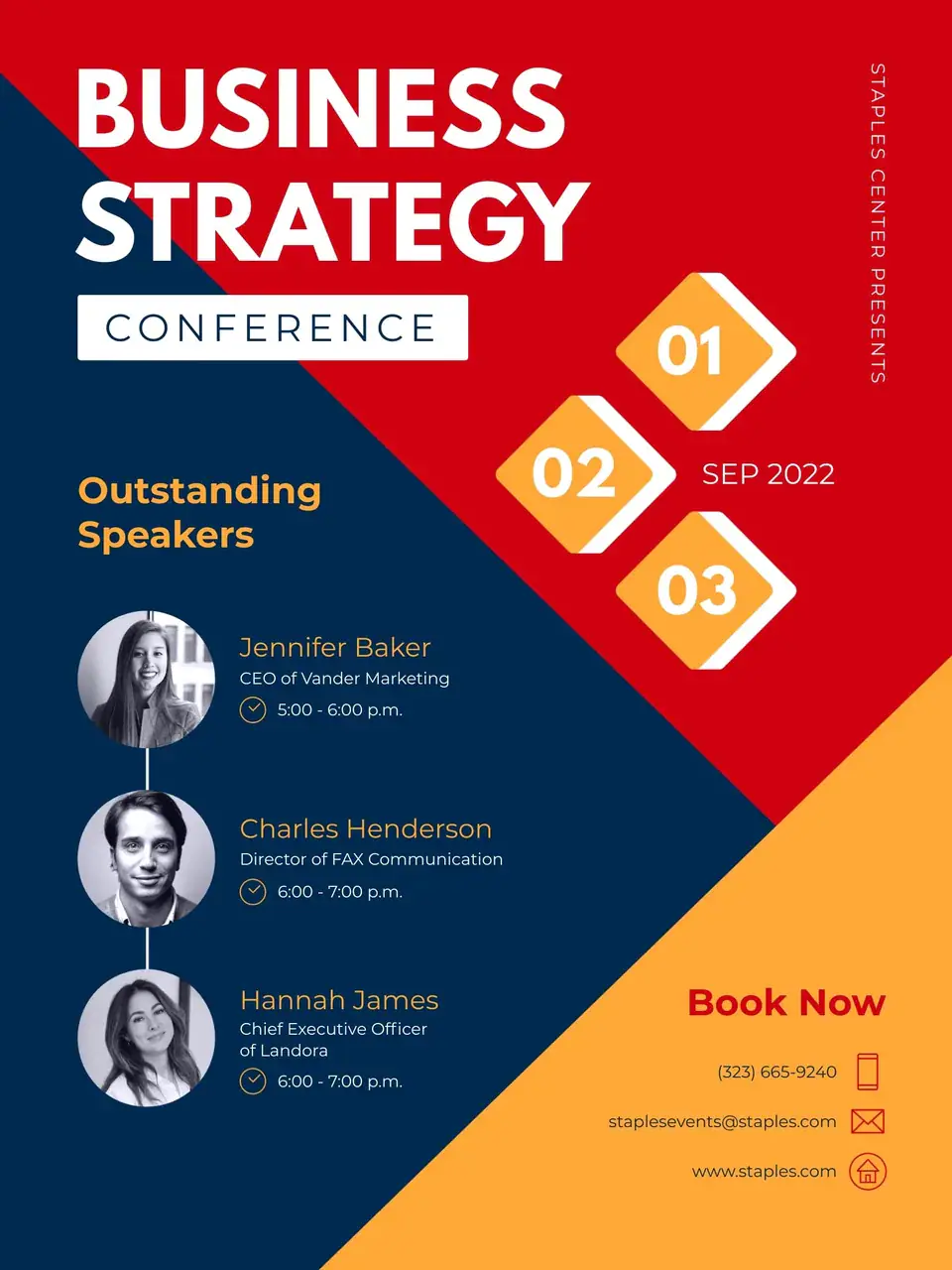
Make the event name easy to find, with the date and venue close behind. Use contrast to separate practical information from the visual theme so someone can understand the invitation at a glance.
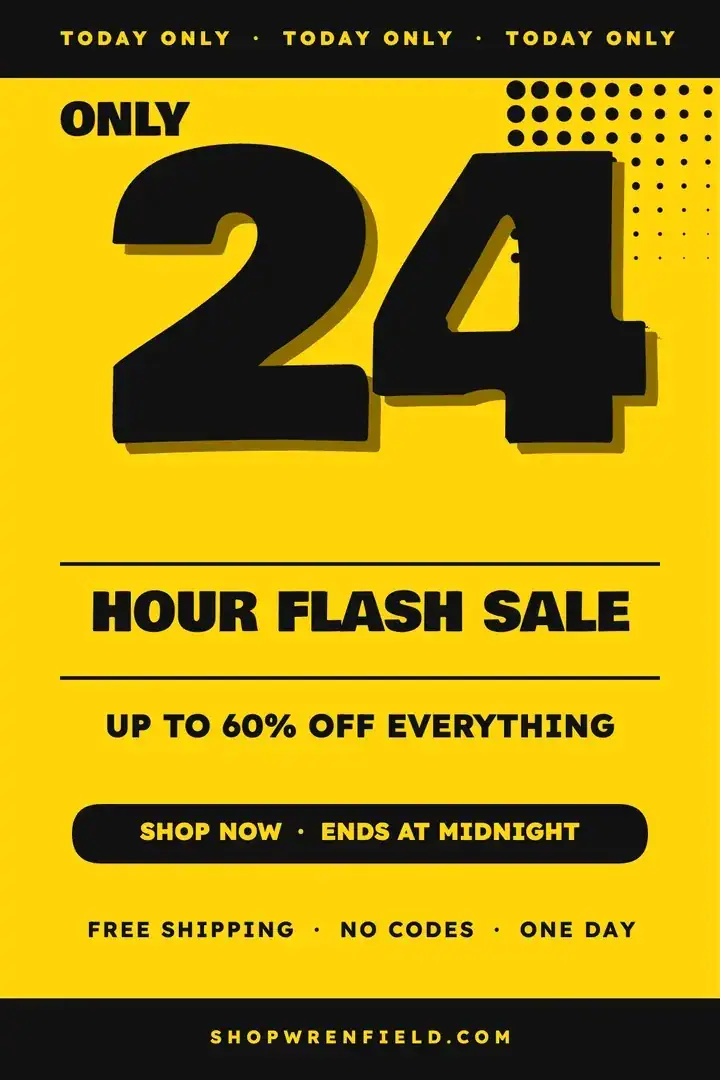
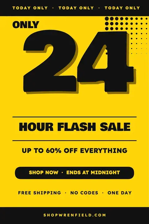
Build the composition around one offer. Give the discount, end date and next action different levels of emphasis, with enough space for the offer to stay readable on a small screen.
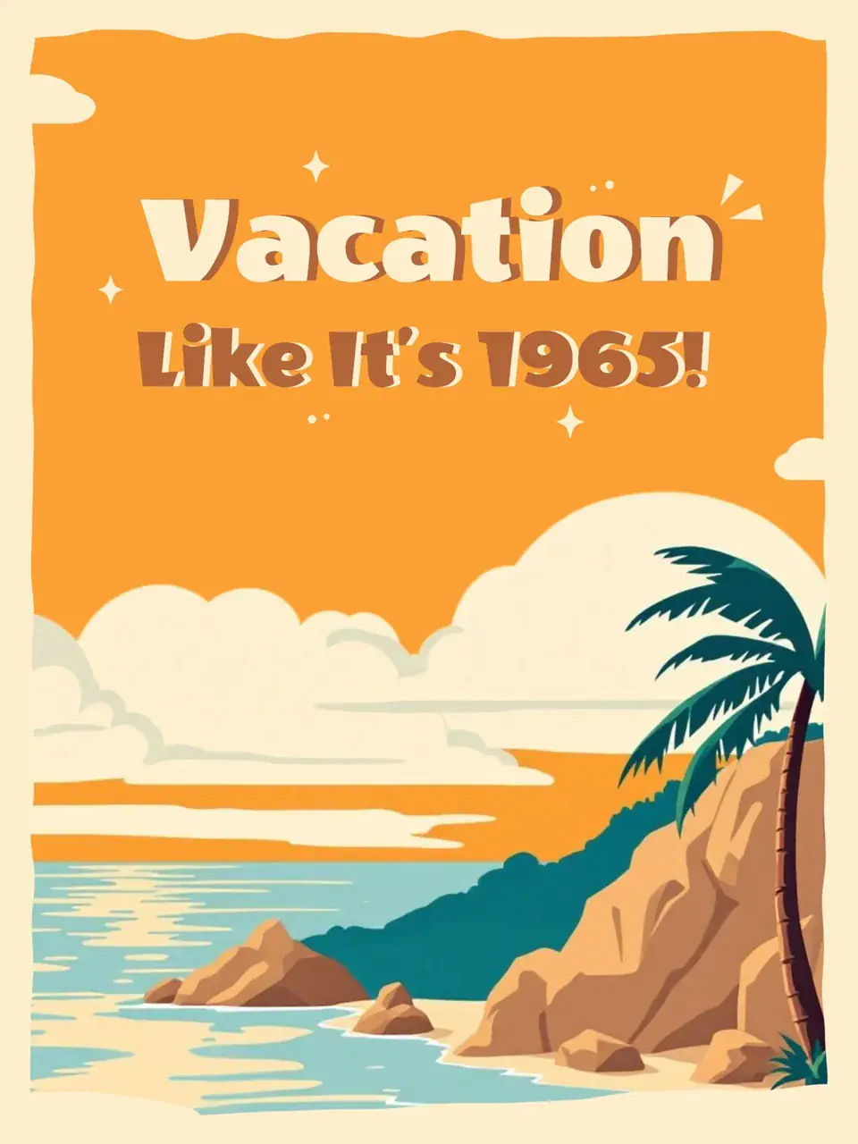
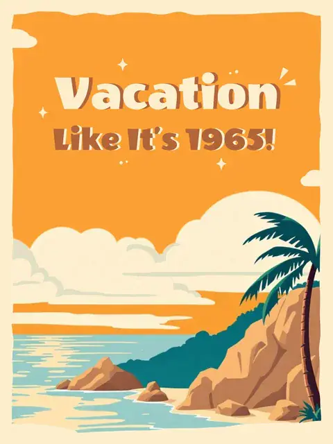
Use a place, a mood and a short invitation to shape the design. Illustrated scenery and a limited palette work well when the destination should carry more of the message than the supporting text.
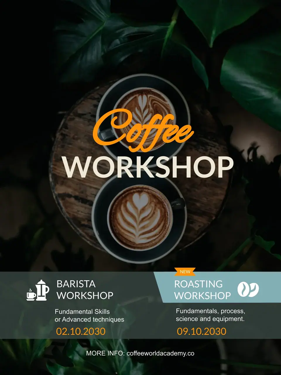
Tell people what they will learn before adding the schedule. A focused subject image, a clear workshop name and a short booking instruction give your audience a useful starting point.
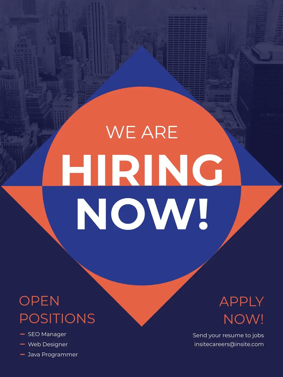
Put the opportunity first: a role, an open day or a local cause. Keep requirements concise and make the response route obvious, whether that is an email address or an event location.
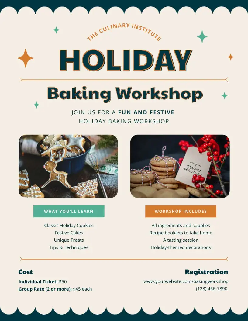
Start with the occasion and the feeling you want to create. Give seasonal illustration room to breathe, while keeping the invitation, date and location in a simple, consistent reading order.
Use the AI poster generator to explore a composition around a real message. Start with a written brief, introduce a reference when it helps, and choose a shape that suits the destination.
Describe what the poster is for, who should notice it and what they should do next. Include the exact headline in quotation marks, followed by the most important supporting details. Then describe the visual direction: a bold typographic sale, an illustrated travel scene or a quiet product composition. A useful text to poster brief connects these choices instead of listing unrelated style words. For a restaurant promotion, for example, name the dish, specify the offer and ask for a clear space around the price. Generate a first direction, then refine the brief around what matters most.
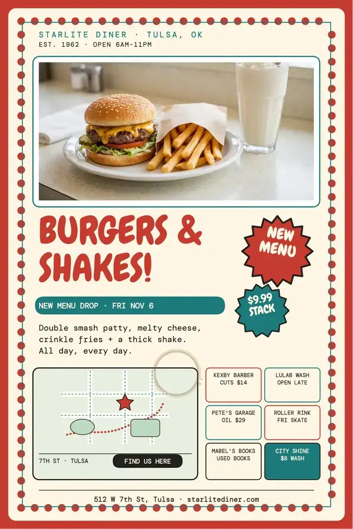
Switch to Image to Image when a product, person or location should guide the result. Upload a clear reference and describe its role in the composition: a bottle in the center, a portrait beside the headline or a building behind the event details. Explain what should stay recognizable and what you want to change, such as the background, color palette or lighting. When you review the result, compare important details with your original, especially packaging, faces and logos. A reference gives the model direction; your brief still needs to explain the poster’s message and layout.
Choose an available aspect ratio before generating. A portrait composition gives a headline and central subject room to stack vertically. A square poster works well for a social feed, while a landscape layout can place an image beside the announcement. Adapt the brief as you change formats: reduce secondary text for a small preview and ask for breathing room around the edges. Review each version at its intended display size before downloading. If the poster will be printed, check the downloaded pixel dimensions against your printer’s required size, resolution, margins and bleed.

Move from an idea to a downloadable image in three practical steps.
Enter the poster’s purpose, exact headline and essential details. Add the audience, mood and preferred colors. You can also choose a brief from the ideas above and replace its sample wording. Keep the main message short enough to read before someone scrolls past, with secondary details clearly separated.
Select the model, aspect ratio and output settings offered in the workspace. Add an image reference if the subject should follow a photo. Check the displayed credit cost, sign in when prompted and generate. The available settings depend on the model, so choose them for the poster you actually need.
Inspect the headline, dates, prices and small details at full size. If the hierarchy or subject needs work, revise the brief and generate another version. Download the result you want to use, then preview it in its destination so text stays legible and important information remains inside the visible area.
These four decisions make a poster easier to understand and give you a clearer way to judge the result.
Decide what readers should notice first, second and third. A sale might lead with the offer, followed by the product and deadline. A movie concept might lead with the title and a single dramatic subject. Specify the reading order in your prompt, rather than giving every line the same importance.
Write the headline and essential details exactly as you want them to appear. Short text gives the composition more room and makes mistakes easier to spot. Keep long descriptions in the accompanying post or event page. Before sharing, check every name, date, price, contact detail and punctuation mark against your original brief.
Choose a few connected cues, such as botanical illustration with warm paper tones, or a bold headline with a limited color palette. Describe the main subject and where it belongs. For a series, reuse the same color and composition instructions, then compare the outputs together to choose the most coherent group.
Think about where someone will see the design: a phone screen, an event listing or a printed notice. Select a suitable shape and leave important content away from the edges. Check small text at the final viewing size. For physical output, confirm the printer’s specifications before choosing your final file and print dimensions.
What to include, how to work with references and what to check before sharing your design.
Start with the words you want people to remember. Add a visual direction, choose a format and make a first version you can refine.